The LiveWatch/Brinks Design System: From Creation Through Rebranding

Background
Unmanageable Design & Technical Debt
In 2016, LiveWatch's web ecosystem hit a breaking point.
After several years of rapid growth, our CSS was bloated, conflict-ridden, and inconsistent. Site performance suffered and simple design changes often triggered a series of mysterious bugs.
To make matters worse – we had four web platforms, each with their own CSS quirks, meaning global style changes often required four bespoke solutions.
On the design side, we had a high-level brand style guide, but no formal UI standards, leading to rogue landing page and email designs that barely resembled our main site.
Our designer-developer handoff also suffered. Without detailed design specs, even the nicest wireframes came out looking lackluster, requiring multiple rounds of cleanup.
Challenge
Reimagine how we build UIs from the ground up
Instead of simply rewriting our CSS and improving our design documentation, it was clear we needed to hit reset and approach our issues holistically.
Our high-level goal for the project was a lofty one:
Empower developers to build UIs as quickly as possible without sacrificing consistency, scalability, and performance.
Additional Goals & Constraints
- Compatible with our 4 web platforms (Rails, Angular, .NET, Hubspot).
- A Single Source of Truth for global styles.
- Usable by team members with only entry-level front-end dev skills.
- Flexible – It can't be so rigid and dogmatic that it impedes experiment-driven projects, such as landing pages.
- Light on process changes – with mostly self-managed devs and relatively few technical managers, introducing new dev processes was hard to sustain.
Role & Team
In my role as Lead UX Designer & Developer, I proposed and managed the project, collaborating with a Front-end Developer and a Junior UX Designer to design and implement it.
Research & Preparation
Finding common threads & learning from existing tools
At the time, design systems as we know them were a nascent concept. A few large brands had released stunning, comprehensive design systems, but those felt neither realistic nor appropriate for our small team.
Our theme was pragmatism:
- Don't Reinvent The Wheel – leverage existing tools and methodologies where possible.
- Design a system to address our problems rather than emulate what's trendy.
Research Area 1 - CSS Methodologies
Much of our scalability and performance issues were the direct result of poor CSS management. While CSS is one of the easiest language to learn, we learned the hard way that it's also one of the hardest to scale and maintain.
To address this, we immersed ourselves in the newish concept of CSS Methodologies—rubrics for naming, structuring, and organizing CSS. With strong overlap in their principles, we were able to pull common themes and best practices from each of them.
- Atomic CSS
- ITCSS
- SMACSS
- BEM
Key Finding - ITCSS, with its data-backed approach to organizing CSS to improve maintainability and scalability seemed like a no-brainer for us.
Research Area 2 - Team Feedback
With our internal dev team (including ourselves) as our users, we asked devs to reflect on times when building UIs was hard and why, as well as times when building UIs was easy and why.
Key Finding - most devs dreaded writing CSS and preferred UI frameworks, such as Bootstrap, which allowed them to make something nice looking without writing any CSS.
Research Area 3 - UI Frameworks
Building on feedback from our dev team, we evaluated three popular UI frameworks to distill the ways they made development easy and apply those to our own solution.
- Foundation
- Semantic UI
- Bootstrap
Key Finding - the soon-to-be-released version of Bootstrap (v4) will allow a level of visual customization that wasn't possible with UI frameworks. Perhaps we could build on top of it rather than just emulating it?
Preparation - Ecosystem-wide UI Audit
We ran a full visual audit of our site, cataloguing UI elements and states, eliminating redundancies, and selecting a canonical version of each element.
The Result
A dedicated space to build, test, document, and host global styles & UI
Beyond a shift to new tools and methodologies, our system involved an organizational shift – UI specialists should do as much of the heavy lifting as possible for UI development, enabling busy full-stack and marketing developers to focus on their core work.
To support this shift, we created a new code repository to serve as a sandboxed hub for developing and testing global UI and styles.
This repo consisted of:
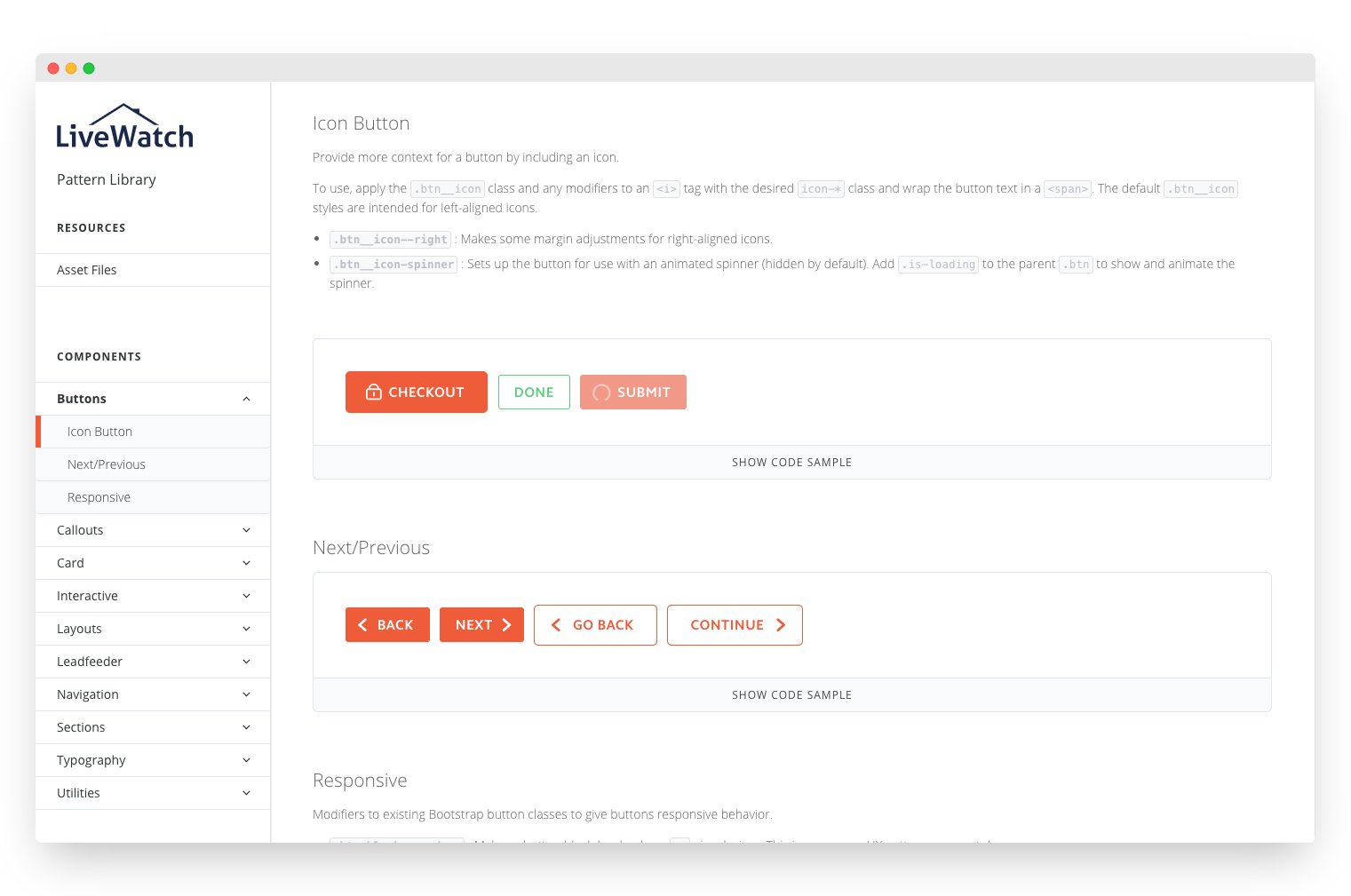
- All-new global CSS: a combination of a themed Bootstrap 4 components and custom UI components, organized using the ITCSS methodology . Building on top of Bootstrap solved two problems: (1) provided us with free code and documentation for many of the UI elements we needed, and (2) sped up onboarding, since many developers were already familiar with Bootstrap.
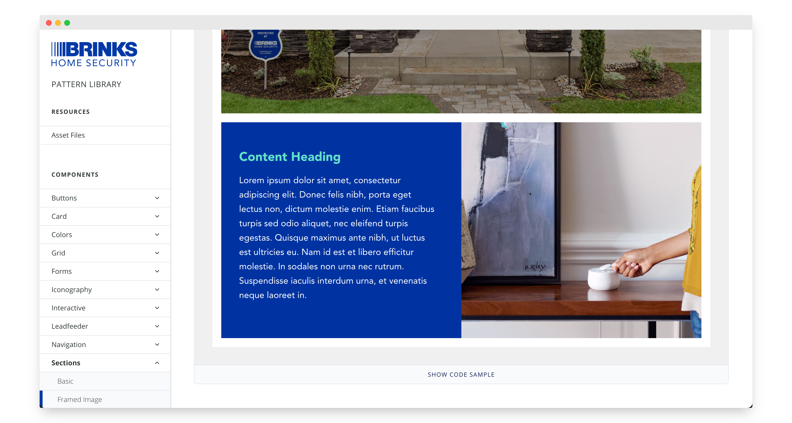
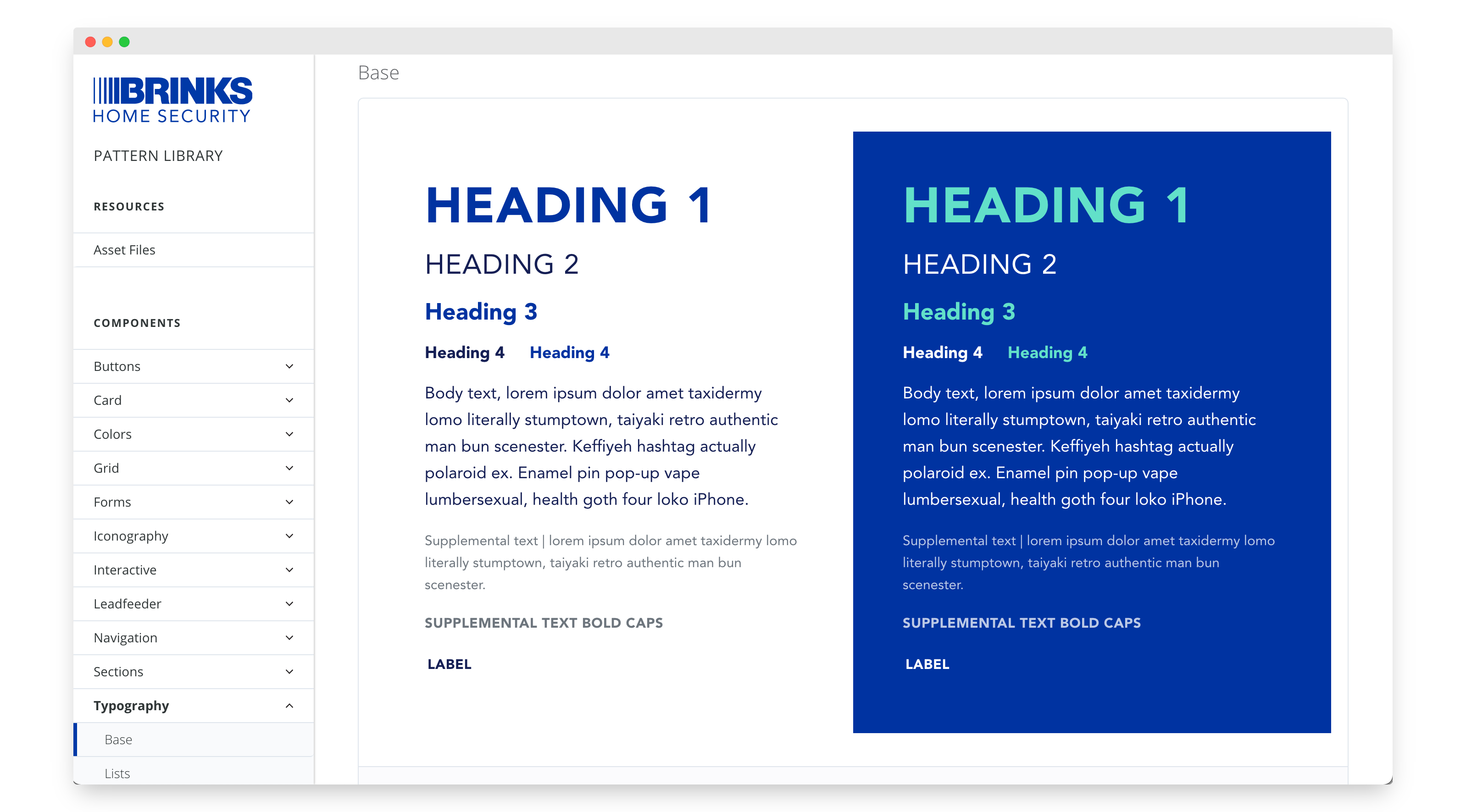
- A Pattern Library for showcasing and documenting any custom elements and patterns that weren't part of Bootstrap. As a live site in itself, this library also served as a sandbox to test and refine changes before releasing them to production sites.
- Static Asset Hosting (CDN) for global CSS, JS, and Fonts. CSS/JS were also made available as modules for use by NPM-enabled apps.
First Impression & Iteration
Doubling Down on CSS Utility Classes
After launching the new system, we noticed many of the benefits we hoped for –
- Quicker dev times.
- Reduced complexity in the designer-developer handoff.
- One-and-done global style changes.
- Improved site performance.
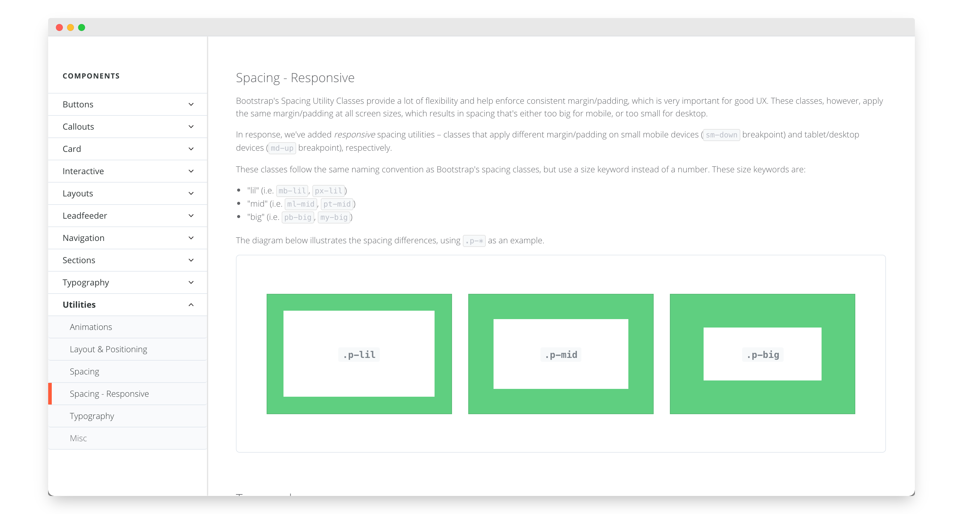
One new Bootstrap feature was a particular hit – CSS Utility classes. These offered developers easy-to-use code for things beyond just UI components – presets for spacing, colors, font-sizes, and more. Even better, they helped reduce CSS file sizes, a win for performance.
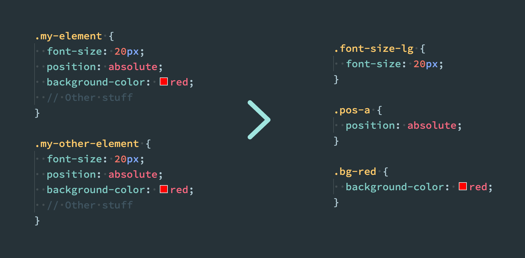
This feature was key in addressing one of our constraints: Flexibility. These classes empowered our Landing Page Optimization team to quickly build more experimental designs without introducing bugs and straying too far from our brand.
These were so easy to use that even two non-developers, a Designer and a Business Analyst, were able to comfortably code entire pages. And as a designer-developer, I was to skip the wireframing stage for simple projects, prototyping directly in code.
Given the success of this approach, we expanded our library of custom utility classes, giving them a dedicated place in the Pattern Library:
Curveball
A simultaneous merger & rebrand
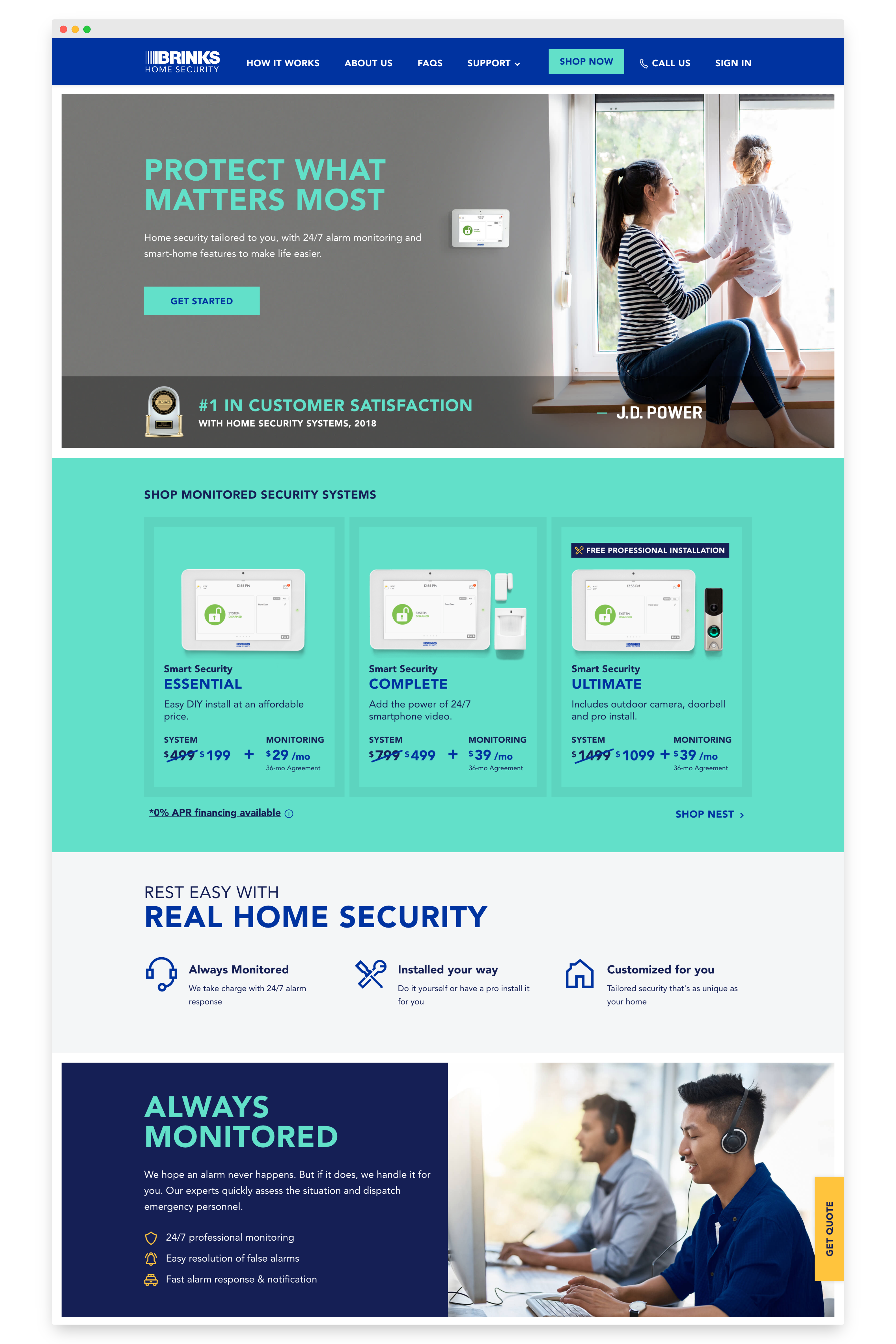
2018 brought a big, but positive surprise – LiveWatch merged with its acquirer, Monitronics, the second-largest home security provider in the US after ADT. On top of that, in a partnership with Brinks', the combined company rebranded as Brinks Home Security.
I was promoted to UX Director of the merged company and was tasked with overseeing the re-skinning of the newly merged companies' 8+ consumer-facing web platforms, followed by a redesign of the core website.
This was the ultimate test for the LiveWatch design system. Could it go from being a tool for a startup to powering a publicly traded company with a team multitudes larger?
The timeline – 3 months for the re-skin, followed by 3 months for the redesign.
Re-skinning
The first step was to re-skin the design system itself, and Bootstrap made this a piece of cake – we updated global variables (now commonly known as Design Tokens) to match the new visual identity, and voilà!
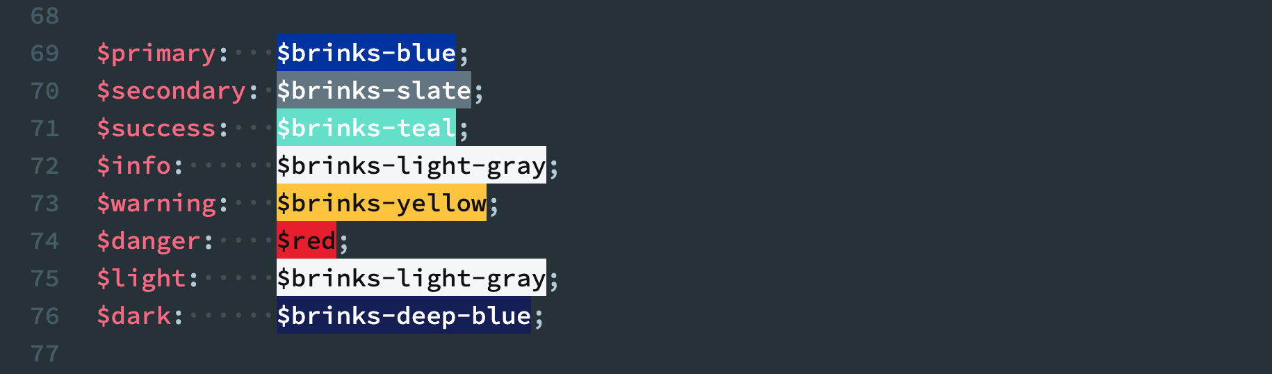
That was all that was needed to re-skin of the former LiveWatch portions of the ecosystem. For the Monitronics portions, we dropped in the global stylesheet generated by our design system and used utility classes to clean up any visual bugs.
Overall – the design system helped us finish in a matter of weeks what leadership feared would be the most time-consuming part of the rebrand, buying us time to get ahead on other tasks, like rebranding our internal tools.
Redesign
The second phase of the rebrand, the redesign, required the biggest change to our design system yet.
One obstacle was that the redesign wasn't done by our team, but was contracted out to an agency before the rebrand was announced. As such, we had to work with what we were given–static wireframes for pages–rather than follow the component-centric approach we would've preferred.
Using a process similar to the Audit step in the Research section, we broke down the wireframes into common elements and patterns, coded them in accordance with our CSS standards, and added them to the Pattern Library.
Once the Design System updated and the new elements well-tested, our developers, many new the team, swiftly built the new pages.
Learnings
Looking Back
All in all, this project accomplished the main problems we set out to solve:
- It made building UIs much faster and easier.
- It improved the consistency of our user experience and made it less bug-prone.
- It made our CSS more lightweight & performant.
- And it passed the ultimate scalability test during the merger and rebranding.
I'm also proud to see that we happened upon some approaches that have since become popular in UI development:
- Sandboxes for both developing, testing, and documenting UI, such as Storybook.js (which we later began using)
- Utility Class-driven CSS development, which now has entire UI frameworks devoted to it, such as Tailwind and Tachyons.
Opportunities for improvement
- Become an interdisciplinary knowledge base – while our design system was mostly developer-centric, many great design systems are centralized documentation hubs for a variety of teams.
- Better versioning – tracking and managing which version of a global asset was used by each platform in our ecosystem was a primary pain point.
- Consider moving off Bootstrap – Bootstrap served as an excellent bootstrap earlier on in the project, but became less and less relevant as time went on. Bootstrap upgrades, particularly those with breaking changes were very time-consuming.
- Improved methodologies for A/B testing UI – once an element is in the design system, it can make it feel like that element is set in stone. We developed an informal process for A/B testing UI and folding winning variants into the design system, but baking split testing tool into the design system itself would be a huge improvement.